How to Choose the Right Color or Print for Your Window Treatments
March 20, 2020
 Picking out window treatments in Dallas can be exciting… but it can also be a little overwhelming. Not only do you have to decide what type of window treatments you want, but you also have to think about which colors or prints will work well within the room and mesh with your personal style. In this blog post, Rita provides some practical tips to help you select the ideal color or print for your window treatments.
Blending vs Contrasting
One of the first decisions you must make is whether you want your custom drapery in Dallas to blend with the room or contrast it. Both choices can look lovely. If you choose to blend, opt for a window treatment color that is just a shade or two different from the wall that surrounds it, or that matches another dominant color in the room.
If you want to contrast, you can take this opportunity to add an extra level of depth to your room’s style. In a room with mostly neutral colors, colored curtains create a vivid pop of brightness that can really draw the eye. In a room with dark, rich tones, lighter curtains can hep to create a balance, and the same is true of darker curtains in a room with a lot of lighter colors.
Prints vs Solids
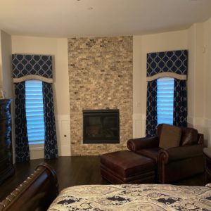
A general rule of thumb is that if you have a lot of prints in your room already — for example, on your walls, rug, or bedding — it is best to choose a solid color for the window treatments. Otherwise, your space may end up looking a little too busy. However, there are exceptions to every rule. A printed curtain that complements other prints in the room can look beautiful under the right circumstances. You just need to be careful that the prints’ colors and patterns do not clash with one another.
Large vs. Small Prints
Generally, small prints are regarded as a poor choice for large windows or large rooms because they can look busy and overwhelming. However, that is not always the case. For example, a small print in well-chosen colors can bring out other elements of the décor and really complement the room’s overall look and feel. A subtle, small print that features different tones of the same color can work similarly to a solid-colored window treatment.
Large prints with contrasting colors are an opportunity to add interest to a room. Large prints with neutral tones work especially well because they can be dramatic without being overbearing.
The above information is just the tip of the iceberg when it comes to choosing prints and colors for window treatments. If you are looking for personalized guidance on how to pick out the perfect coverings for your windows, a local home décor expert would be happy to help.
Meet Rita
Rita Tayefeh is an interior design and window treatments experts in the Dallas area. Her keen eye and years of experience equip her to help homeowners and businessowners choose window treatments that are functional, beautiful, and complementary to a room’s existing décor. If you would like to learn how Rtita can help you dress up your windows in the ideal way, contact her team at 214-533-0843.
No Comments
No comments yet.
RSS feed for comments on this post.
Sorry, the comment form is closed at this time.